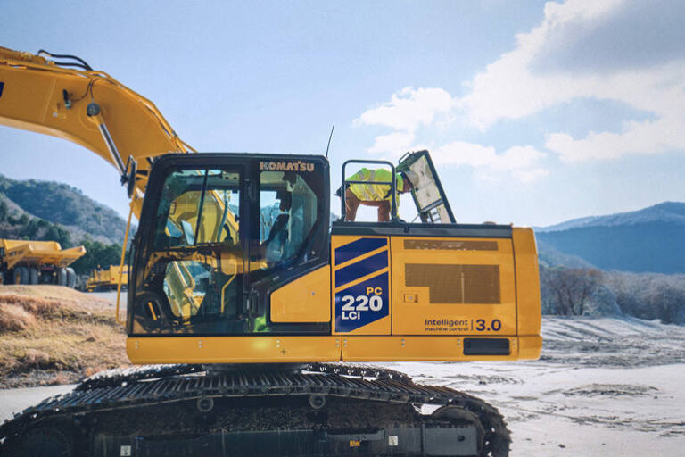
Komatsu has announced a bold new visual identity (VI) for its machinery – the first significant change to its livery since 2001. The refreshed look introduces three diagonal stripes across Komatsu equipment, replacing the horizontal ones that have been in place for over two decades.
More than just a cosmetic change, the updated livery reflects Komatsu’s commitment to people, the planet, and progress. According to the company, “It’s a tangible expression of Komatsu’s human-centered design philosophy.”
The iconic three stripes have long symbolised Komatsu’s core focus areas: utilities, construction, and mining. As the company has grown to serve a broader range of industries, the diagonal rework represents a shift toward movement, momentum, and collaborative growth. Komatsu says the three parallel lines now represent society, customers, and employees — all moving forward together.
Designers from Komatsu’s in-house team undertook significant research to ensure the new stripes remained instantly recognisable while signalling a fresh direction. The new orientation makes the machines “look younger, longer,” according to internal studies. Importantly, the livery also improves resale potential by keeping machinery looking modern and relevant — a significant factor given Komatsu equipment is often in service for 30 to 40 years.
In addition to the new stripes, updates will be made to technical identification decals and other branding elements, creating a more cohesive and professional appearance across the entire machine.
Komatsu’s livery has evolved through several eras. In 1968, the company introduced a “dumbbell” symbol. By 1984, a two-tone yellow and blue scheme had been adopted, followed by a switch to Natura Yellow in 1996. The 2001 update introduced the now-familiar three blue stripes, ushering in a globally aligned visual standard that improved brand cohesion and customer recognition.
The current update marks the most substantial change since then. While it will first appear on new equipment, Komatsu has confirmed the refreshed livery will gradually be rolled out across its global fleet.
The redesign aligns with Komatsu’s human-centered approach to design. From operator comfort to community impact, the company considers how each element – visual and functional – supports people. Designers work hand in hand with engineers and stakeholders to deliver products that are practical, safe, and visually appealing.
“A dated design can make a product or brand appear outdated, uncompetitive, and less appealing,” said Komatsu. By modernising the look of its machines, the company is reinforcing its position as a future-ready leader in heavy equipment.
As the industry evolves, Komatsu’s updated visual identity represents more than a new coat of paint. It signals a continued investment in design that balances aesthetics, longevity, and innovation — a reminder that even machines built for the toughest environments can carry the elegance of thoughtful design.


